Recently, the National Institute for Health and Care Excellence in the UK published a consultation document in which it suggests that the threshold for treating people with statins should be lowered. Currently, doctors are advised to consider treatment for individuals who are calculated to have 20 per cent or more risk of developing cardiovascular disease over the next 10 years. NICE is proposing that this threshold is reduced to 10 per cent or more.
We already know that statins simply do nothing for the vast majority of people who take them, and this situation will only worsen if people at lower risk take these drugs too. But we should not forget that the risk of adverse effects from statins comes in at around 20 per cent of people. I wonder if perhaps the nice people at NICE have perhaps taken leave of their senses.
But even if we accept the idea that the risk threshold is lowered, how is ‘risk’ assessed, and how accurate are our predictions?
Cardiovascular risk if usually assessed with algorithms based on supposed risk factors such as cholesterol levels, blood pressure, smoking and body mass index. The predictive tool that NICE prefers is known as QRISK2. Here’s a brief description of this tool as plucked from Wikipedia:
QRISK2 (the most recent version of QRISK) is a prediction algorithm for cardiovascular disease (CVD) that uses traditional risk factors (age, systolic blood pressure, smoking status and ratio of total serum cholesterol to high-density lipoprotein cholesterol) together with body mass index, ethnicity, measures of deprivation, family history, chronic kidney disease, rheumatoid arthritis, atrial fibrillation, diabetes and antihypertensive treatment.
Recently, someone tweeted me about the potential problems with QRISK2 and other predictor tools. This led me to a paper published in the British Medical Journal in 2010 that assessed the accuracy of QRISK2 as a cardiovascular disease risk predictor.
Below is an adaptation of figure from this study that graphically represents the performance of the QRISK2 predictor. The two figures in my adaptation represent women to the left and men to the right.
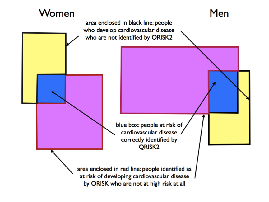 The yellow rectangle represents people with cardiovascular disease. The purple rectangle represents people deemed to be at high risk according to QRISK2. In the ideal world, the purple rectangle would sit exactly over the yellow rectangle (which would mean that QRISK identifies all people at risk of cardiovascular disease and does not label as ‘high risk’ those who are not).
You can see from the figure, though, that:
1. QRISK2 actually only accurately identifies a minority of people at risk of cardiovascular disease.
2. Identifies many people as being at risk who are not at all (with the potential that they will be exposed to unnecessary treatment and possible adverse effects).
In other words, QRISK2 does a lousy job. And this is the tool NICE recommends doctors use to make decisions about our care, and particularly whether or not we are good candidates for a statin. Quite frankly, it’s just not good enough.
References:
1. Collins GS, et al. An independent and external validation of QRISK2 cardiovascular disease risk score: a prospective open cohort study. BMJ 2010;340:c2442